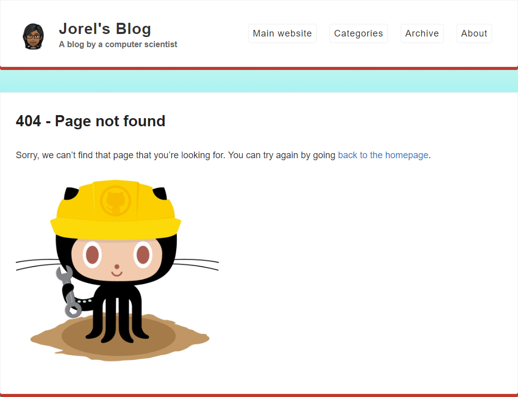
Error 404 - Page Not Found. The most famous error message in the world. I think it’s about time I made a better 404 page!
The 404, page not found, error message crops up when browsing the web when the page you’re looking for doesn’t exist. This allows website owners to reach into their inner creativity to produce an error page with whatever content they want. There are many blog posts on “the best 404 pages”, including my favorites below:
- blizzard.com which looks like a broken website
- css-tricks.com which shows the inner css code of a website
- kualo.co.uk which has a space invaders game
- hotdot.pro which shows interactive particles
- everipedia.org which shows their page on the explanation of the 404 error
The old page
My old 404 page was pretty dull. It still used the template from Jekyll Now and seemed out of place for my blog. It even has the octocat as the main icon! I mean yeah, my blog is hosted on GitHub, but I don’t want an octocat on my 404 page - it’s GitHub’s mascot, not mine!
Plans for a new page
Since my blog is targeted for a more “relaxed” audience (i.e. writing style is not serious), I’ve decide to create a 404 page which can entertain users. I thought of the idea of “I couldn’t find the page you were looking for, but can you find Wally?”
I discover HTML’s onload event and link it to a script to generate a random number, which would be used to choose a random Where’s Wally? picture numbered from 0 to 7. There’s just one issue: The image is far too small to actually see each individual character. Somehow, I have to make the image larger!
Initially, I think of using a zoom-in method, where clicking on the image shows a full-sized version of the picture which can be navigated with the mouse. However, after looking at the complexity of the code for creating a modal image, I decide to search for alternative methods.
After browsing through w3schools.com for a bit, I come across the amazing magnifier glass. Perfect! It adds extra entertainment as you can only look at a small portion of the image at a time! I implement the magnifier glass, adjust the width and height to match the size of the image and give it a test run.
The webpage does not load an image. I open up the developer tools and find out that my idea to number the pictures from 0 to 7 has caused me great confusion - my random number generator has a chance to generate the number 8, which isn’t an option in the list of images! After fixing the issue, I run my tests to check that it would work properly on mobile.
The magnifier is so tiny on mobile that the added zoom still doesn’t make much of a difference! I quickly search online to solve the issue and discover the power of using the viewport. Instead of using a magnifier for mobile, what if I just let mobile users zoom in using the simple pinch-zoom gesture? Genius! Of course, I have to ensure that the user is on a mobile device so I can disable the magnifier for them.
And that completes my 404 page, with an extra bit of fun for anyone who somehow gets lost on my blog.
